How to fix an awkward space
In a home with no square-footage to spare, two awkward areas were going to waste. Here’s how a designer transformed them.

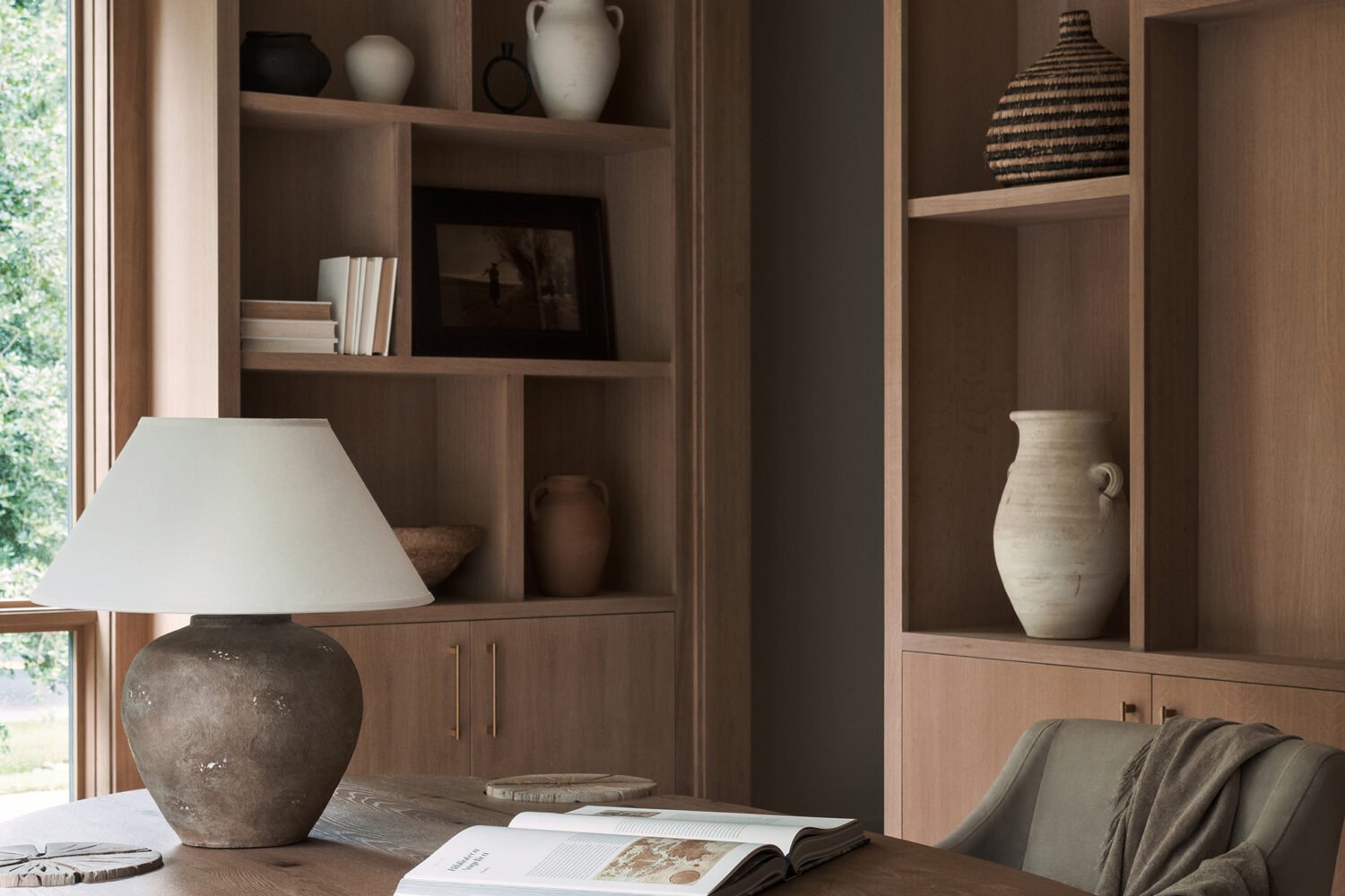
When Amanda and John Volkoff remodeled their Annapolis kitchen, a wall came down that had blocked off a small anteroom, connected to an equally small screened-in porch. The Volkoffs had never known what to do with either space, and all of a sudden there was nothing hiding them.
Hence, Amanda explains, the anteroom became a dumping ground for unused furniture and pantry overflow—a dark, unsightly blotch at the rear of the kitchen. “I feel like every time I looked at that room, all my self-worth came down,” she says, only partly joking.
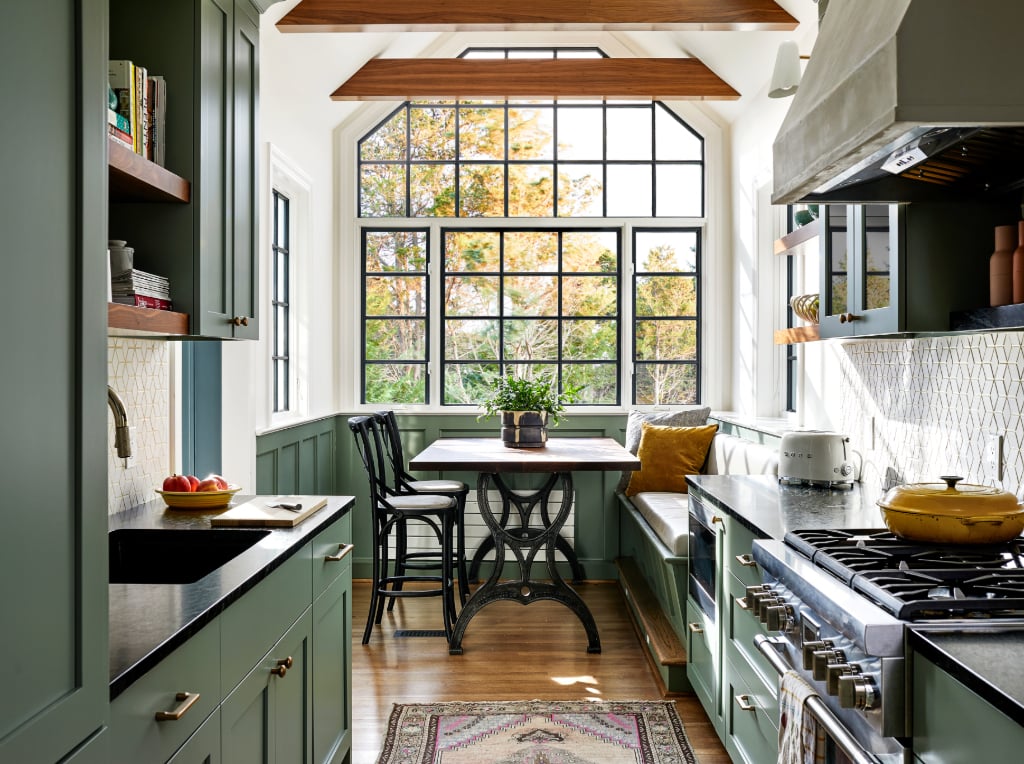
The Volkoffs turned to designer and architect Angela Healy, whom they’d worked with on other areas of their house. In addition to making the spaces usable, they wanted Healy to incorporate a laundry area. The designer joined the two rooms and turned the porch area into a mini-laundry room by enclosing it and installing a washer and dryer as well as cabinetry to hold supplies.
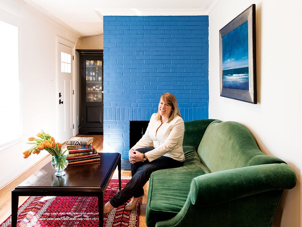
In the space that was previously the anteroom, she created a bay window that provides seating without taking up precious floor space. And the area, formerly known as “no man’s land,” also became the perfect spot for Amanda’s mother’s green velvet sofa, which Amanda had moved all over the house through the years without ever finding it a proper home. The Volkoffs use their new sitting room every day, whether for morning coffee or for cocktails. Says Amanda: “It all makes sense, and it’s lovely from every angle.”
Make a tiny guesthouse feel spacious
This is how you squeeze two bedrooms, a kitchen, a living room, and even a laundry area into one small guesthouse.

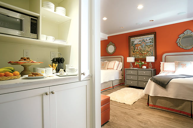
Visitors staying at Stephanie and Larry Stack’s Alexandria home don’t just get their own room. They’re treated to an entire guesthouse, complete with two sleeping areas, a living room, a kitchen, and a washer and dryer. “We have a lot of family that lives out of town, so when they come, we want them to stay in a comfortable environment,” Stephanie says.
Figuring out how to cram all those amenities into the guesthouse’s space required creativity on the part of Bethesda designer Kelley Proxmire. To avoid the appearance that the front door opened directly into a bedroom—and to squeeze multiple uses out of the house’s main area—Proxmire chose a pair of custom-upholstered sleeper sofas rather than traditional beds. A table between them, ready for meals or games, folds flat to be placed against the wall when the beds are pulled out. A proper bedroom with two beds is downstairs, but Stephanie also wanted this room to house the kitchen and laundry. She asked Rhonda Grisham of Kleppinger Design Group in Fairfax to devise a way to hide the appliances behind retracting doors. When they’re closed, you’d never know a midnight snack is steps away.
trick the eye
To create the illusion of more room, a Capitol Hill couple goes against typical design wisdom by adding a wall.
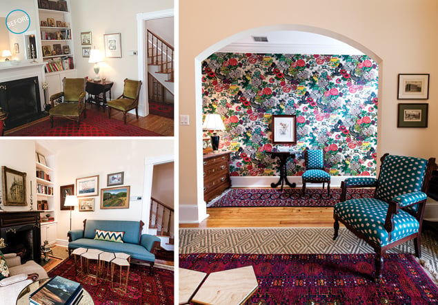
After almost three decades in their cozy Capitol Hill rowhouse, with many upgrades along the way, a nagging problem still eluded Bill and Ginny James: the unceremonious entry into the living room. “This has bothered my wife for over 25 years,” Bill says.
DC designer Annie Elliott quickly made the diagnosis. Beyond the fact that there was no proper entryway, a cramped corner with built-in shelving on one side of the fireplace looked off kilter. Plus, Elliott says, “there were these very beautiful pieces of furniture that were falling apart.”
In a move that might seem counterintuitive for a small space, Elliott added a wall to separate one section of the living room into a foyer with a large, arched opening. By defining it with vibrant wallpaper and moving the couple’s antique marble-topped chest into the new alcove, she created the stylish arrival area her clients had long wished for.
Elliott added another built-in to balance the existing shelves on the side of the fireplace. “The feeling of symmetry is important,” she says. Next, she recovered the couple’s furniture with colors that emerged from the wallpaper, then put in modern touches such as a new coffee table and floor lamp, “so it didn’t look like an antiques store.”
The result is far beyond what the couple imagined, Bill says: “This has elevated our lifestyle—it’s given us a whole new way of living in this house.”
how to repurpose spaces
A tight city condo gets a kitchen that doubles as a high-style headboard—yes, a headboard.
How do you dedicate space for living, working, cooking, dining, and sleeping—all within an 800-square-foot box? Designer Vincent Sagart of Poliform Sagart Studio crafted a solution so clever for his client’s 14th Street condo that the same configuration, furnishings, and art remain even though a new owner has since moved in.
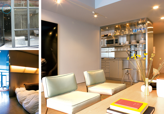
With the windows along the front of the unit as the only source of natural light, Sagart determined there couldn’t be any walls separating spaces—save for the closet and bathroom—because light had to travel all the way through the home. Thus, he engineered a kitchen that’s no more than a room divider—a seven-foot, six-inch panel that contains appliances, a sink, and cabinets on one side while the other side serves as a headboard for the bedroom area. Made of shiny, stainless steel, the panel also bounces natural light off both sides.
For a unit that’s “smaller than small,” says the new owner, Peter Shaw, “you get a feeling that’s it’s a lot bigger.”
How to Streamline
A frustrated first-time homeowner finally achieves the space he desires with streamlined furnishings and visual tricks.
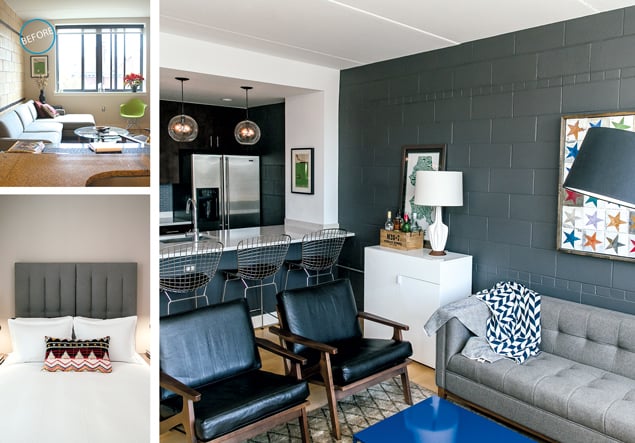
When Alex Wagner moved into his 800-square-foot Logan Circle condo, he thought, “All I have to do is buy all these nice things and put them together.” But no matter how he arranged the furnishings, the configuration never seemed to work. “Every time I walked in there, I was miserable—it just wasn’t functioning in a way that I’d hoped.”
After two years of dissatisfaction, Wagner turned to Kiera Kushlan and Jessica Centella of the DC design firm Residents Understood. “He was trying to do too much in too small a space,” Kushlan says. The first thing to go was the dining table, because a typical night for Wagner involves having friends over for drinks, then eating out along 14th Street. Next, the designers persuaded him to rip out the granite kitchen counter and replace it with white Silestone. They also extended the counter into the living room, creating a bar area perfect for solo dining. A yellow cinderblock wall got painted dark gray. “Having that dark wall contrasts with the view and really draws your eye outside,” Centella says.
In the bedroom, the designers added an extra-tall headboard. Wall-mounted lights leave room for books on the nightstands. Now, Wagner says, “every day I walk in and think, ‘It’s me.'”
This article appears in our March 2015 issue of Washingtonian.

