1 /Pick a theme
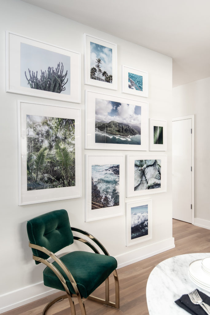
For a gallery wall in her dining room, photographer Laura Metzler went for a tropical theme, using her vacation photos from Miami and Hawaii. “I wanted it to have a very lush feel,” she says. Metzler edited the shots so they’d go together—for instance, by making sure the blues were all cohesive. (If that’s beyond your own skill set, you can buy most of the prints on Metzler’s website, theprintshopbylmp.com.)
2 /Show off favorite memories
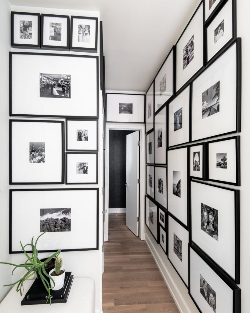
At the beginning of quarantine, with much of her work on pause, Metzler decided it was the perfect time to sort through old photos and find a way to display her favorites. She chose an empty hallway outside the powder room in her Reston home for a floor-to-ceiling gallery of black-and-white shots of family and travels. She got most of the frames from Ikea and Target, which helped keep the extensive project under $1,000. The result is particularly meaningful in a time of social distancing. “I have not hugged my mom or my dad since February 22—I’m counting the days,” says Metzler. “It re-minds my husband and me of family. . . . It just makes me happy every time I go by it.”
3 /Use a corner
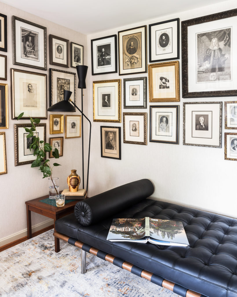
Wrapping the corner of a room with hanging art almost makes the frames seem like wallpaper. Designer Cathy Connon, of Catherine Jordan Design, deployed the technique for clients in Alexandria who collect antique etchings. Though the drawings are all in different frames, their similar style, coloring, and matting make the gallery look unified. Connon decorated the rest of the room—a home office—with sleek midcentury-modern furnishings, creating a nice contrast with the traditional artwork.
4 /Incorporate Plants
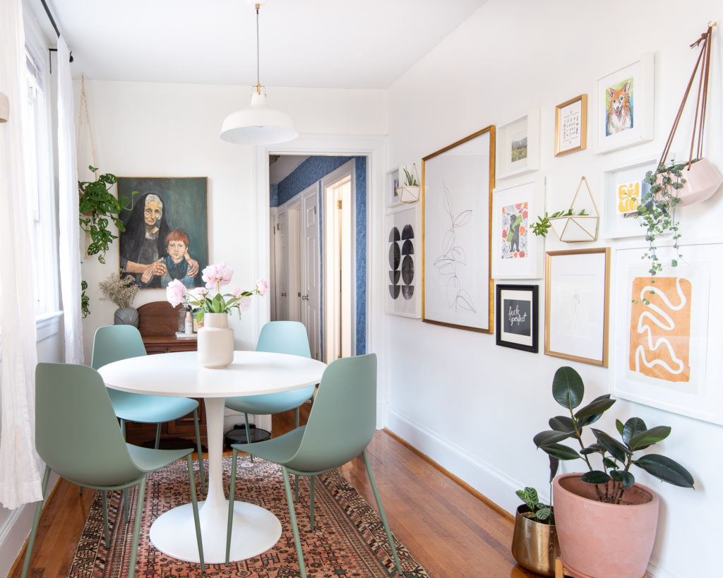
Like so many apartment dining rooms, the one belonging to writer and interior stylist Dominique Gebru had to start pulling double duty as an office when Covid-19 hit. Sitting there for so many hours made Gebru realize that the space’s longest wall “felt like it was begging to be a gallery.” A couple of the hanging plants were already there. Gebru didn’t see a reason to move them, because the spot gets great sunlight. She relocated a third plant and art from other parts of the Park View home to fill in the rest. One easy trick she recommends: Secure lower corners of frames with sticky tack to keep them hanging straight.
5 / Try a striped background
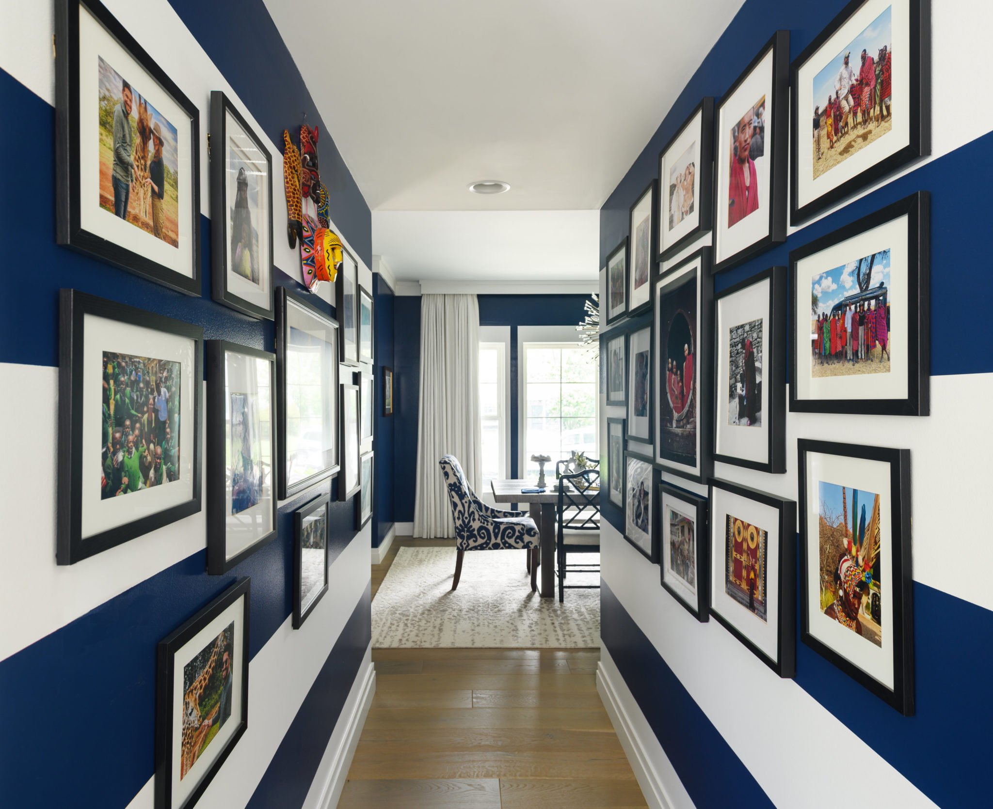
“As soon as I saw the space, I thought, ‘I want to do stripes,’ ” says designer Kelley Proxmire of the hallway in her clients’ Bethesda house. Because the area would also serve as a gallery of the couple’s colorful travel photos, Proxmire knew the background couldn’t be too busy. She settled on stripes about a foot thick to ensure that the hallway would appear fun and vibrant but not messy. Also important: putting all the photos in the same simple black frames.


