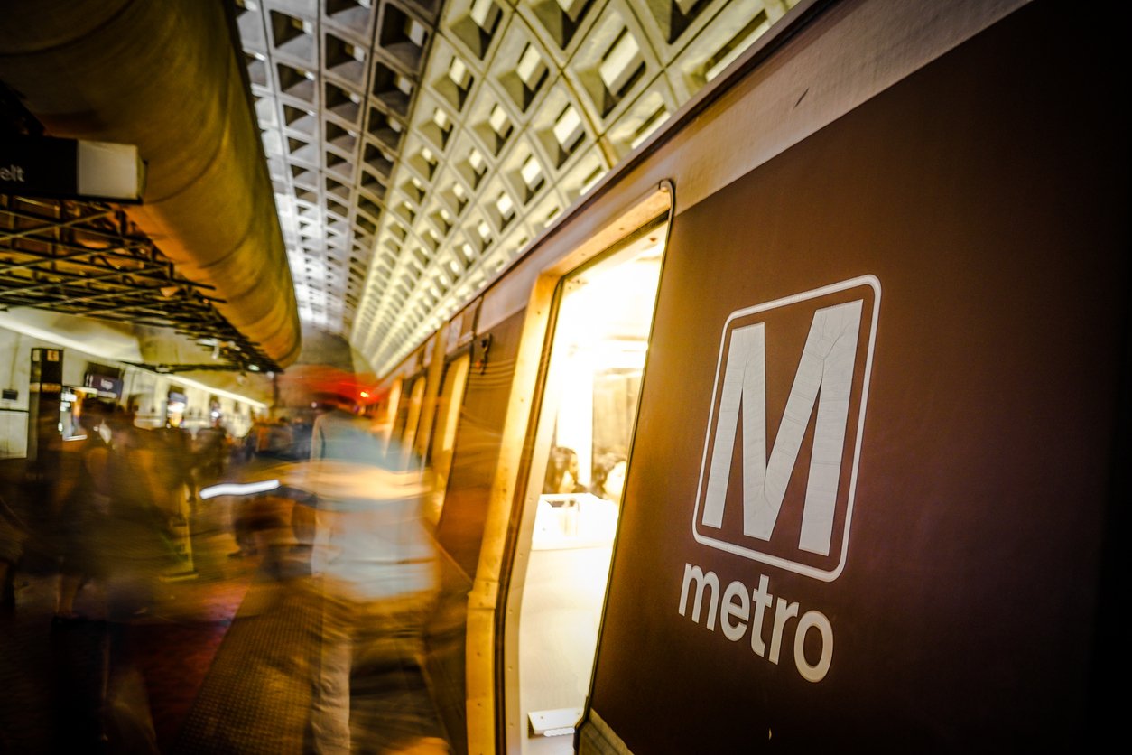
The summer-long commuting hassle brought on by Metro’s closure of Blue and Yellow Line stations south of National Airport is scheduled to come to an end on Monday. But a new trauma awaits graphic-design nerds among the USB ports and easier-to-read screens on some of the platforms: The wrong typeface on the stations’ iconic brown pylons.
This wasn’t supposed to happen. A lot of people noticed that the pylons sported the wrong font after a media preview earlier this summer, and Metro said a contractor used Helvetica Black instead of the standard Helvetica Bold. The mistake “will be corrected at no cost to Metro,” a spokesperson told Washingtonian.
So, uh, what’s this?
The Braddock Road Metro Station will reopen on Monday, barring any unforeseen complications this weekend. @wmata says customers will notice continued maintenance work but the station should be ready for riders! pic.twitter.com/JmjZyQumGo
— Drew Wilder (@DrewWilderTV) September 6, 2019
Here’s what a pylon is supposed to look like:
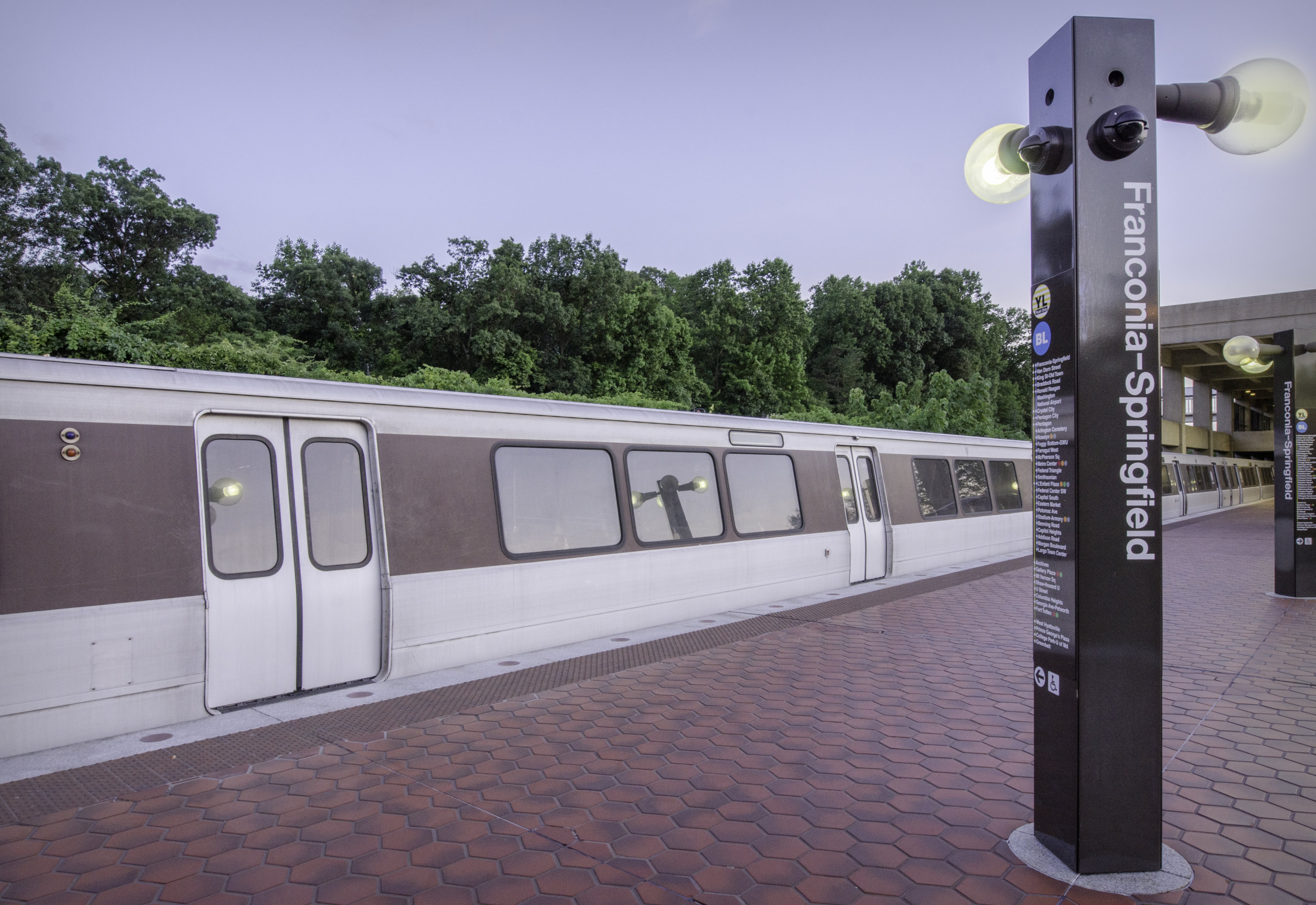
Minor inconveniences to typography-obsessed riders are not top of mind at the transit agency right now, chief Metro spokesperson Dan Stessel tells Washingtonian in an email: “Changing the signs from ‘Helvetica Black’ to ‘Helvetica Bold’ is a punch list item that isn’t related to safety or reliability, which is where we’re focused. As we said last month, the contractor will replace the signs before the end of the project at no cost to Metro. That remains true. Replacement signs are being fabricated, and will be installed as soon as they’re received from the vendor.”
In fact, Stessel says, the font issue is a good reminder that “the project is not over on Monday.” Everything will not be just-so when riders arrive—while the platforms will be safe, “customers should expect to see some ongoing tile work on the mezzanines, for example, as well as a range of other light construction activity into the fall.”

